Vibración terrosa: Cómo usar tonos inspirados en la naturaleza que no sean aburridos
Key Features
- Modern take on earthy paint colors without dull results
- Room-by-room strategies for nature-inspired hues
- Contractor-tested advice from real homes, not theory
If you’re searching for earthy paint colors that aren’t boring, you’re in the sweet spot of where design is headed right now. Homeowners want warmth, calm, and connection to nature—but without turning their house into a bland beige box or a forest cosplay. That’s where earthy vibrancy comes in.
At Lightmen Painting, we’re seeing a massive shift toward nature-inspired paint colors that feel alive, layered, and intentional—colors that work in real homes, under real lighting, and with real life happening inside them. This guide breaks down how to use earthy hues the right way: where they work best, how to avoid common mistakes, and how to make them feel modern instead of muddy.
This isn’t trend-chasing. This is how you make natural colors actually pop.
What Does “Earthy Vibrancy” Really Mean?
Aren’t earthy paint colors supposed to be neutral?
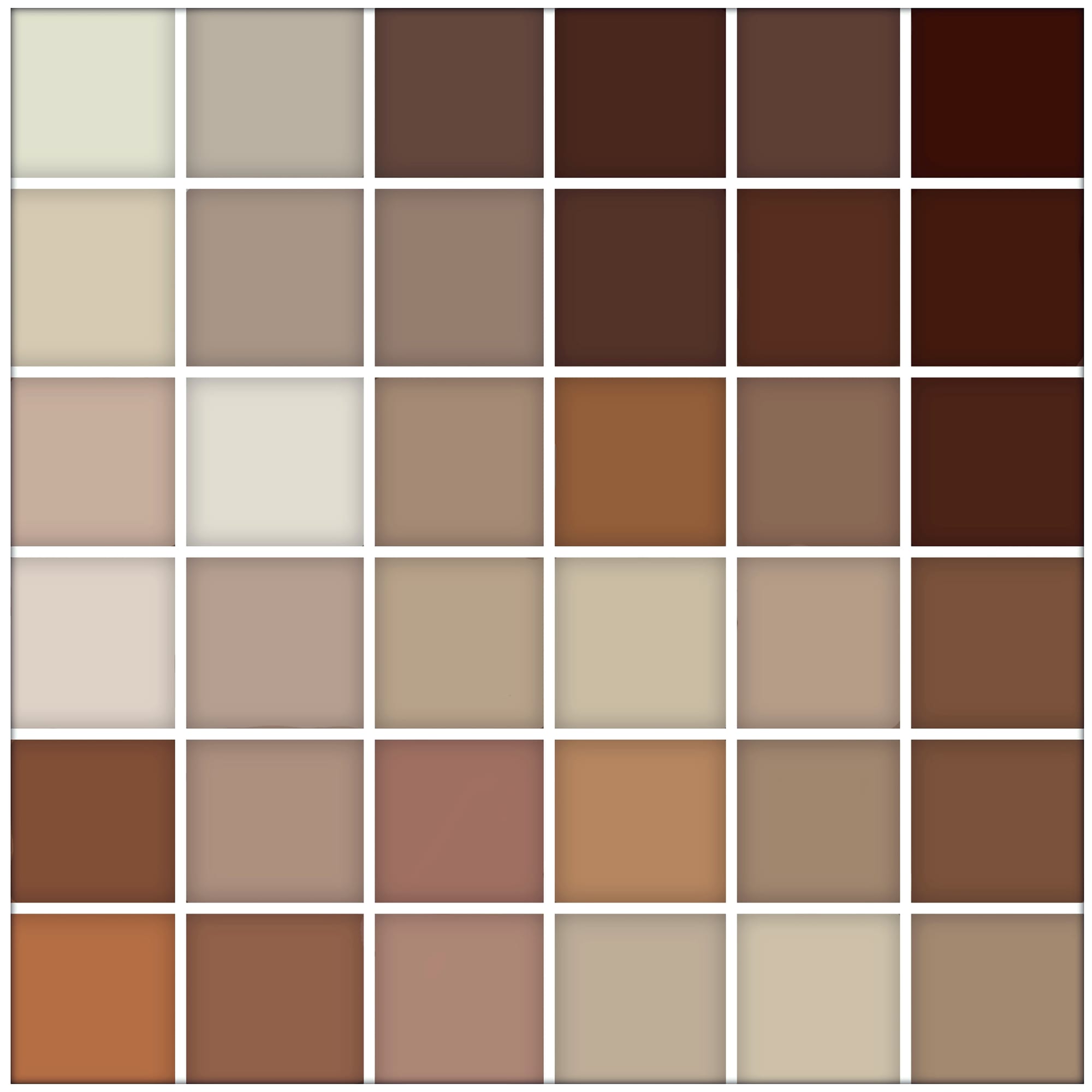
That’s the misconception.Earthy vibrancy isn’t about dull browns or flat tans. It’s about nature-inspired hues with depth, warmth, and contrast—colors pulled from stone, clay, moss, bark, sand, and sky, but refined for interiors and exteriors.Think:
- Clay instead of beige
- Olive instead of hunter green
- Warm taupe instead of gray
These colors feel grounded and intentional.
Things to Know
- Earthy colors need contrast to avoid looking flat
- Undertones matter more than the color name
- Matte and eggshell finishes work best
- Layering beats matching every time
- Prep quality shows more with earth tones
Why Nature-Inspired Paint Colors Are Dominating Right Now
Why are earthy paint colors trending?
Three big reasons:
- Visual burnout – People are exhausted by stark whites and cold grays
- Biophilic design – Humans feel calmer in nature-based environments
- Longevity – Earth tones age better than trendy brights
Search behavior shows homeowners want colors that:
- Feel cozy but not dated
- Look good in different lighting
- Don’t need repainting in 3 years
Earthy vibrancy checks all those boxes.
The Biggest Mistake People Make With Earthy Colors
Why do earthy paint colors sometimes look boring?
Because they’re used without contrast.Flat application = flat result.Earthy colors need:
- Texture
- Sheen variation
- Strategic pairing
Used correctly, they feel rich. Used wrong, they feel… sad.
Earthy Paint Colors That Feel Alive (Not Flat)
1. Clay, Terracotta, and Burnt Sienna (Warm Without Being Loud)
How do you use clay tones without overwhelming a room?
Clay-based colors are powerful—but they work best when contained.Best uses:
- Accent walls
- Dining rooms
- Powder rooms
- Exterior doors
Pair with:
- Soft white trim
- Natural wood
- Matte or eggshell finishes
These tones bring warmth without screaming for attention.
2. Olive, Moss, and Eucalyptus Greens (The New Neutral)
Are green paint colors considered earthy?
Absolutely—and they’re some of the safest “bold” choices you can make.Why they work:
- They read neutral from a distance
- They complement wood, metal, and stone
- They feel calming, not trendy
We use these constantly for:
- Kitchens
- Home offices
- Bedrooms
- Exterior siding in natural settings
Green is earthy vibrancy done right.
3. Warm Taupe, Mushroom, and Stone Colors (Depth Over Beige)
How are these different from regular neutrals?
They have undertones—and undertones are everything.Good earthy neutrals:
- Shift slightly with light
- Feel warm without yellowing
- Add depth without drama
These colors are resale-safe and designer-approved.
4. Dusty Blues and Blue-Grays (Nature Without Coldness)
Can blue be considered an earthy color?
Yes—when it’s muted.Think:
- Slate
- Storm cloud
- Blue-gray
These tones:
- Pair well with warm woods
- Work beautifully in bedrooms and bathrooms
- Feel grounded instead of coastal cliché
Avoid high saturation. Earthy blues live in the middle.
In Our Experience
At Lightmen Painting, earthy vibrancy works best when homeowners stop thinking in single colors and start thinking in systems. The most successful projects use nature-inspired hues with intention—balanced by trim, texture, and lighting. When done right, these colors feel timeless, not trendy.
How to Make Earthy Colors Feel Intentional, Not Boring
Use Contrast (Always)
Earthy vibrancy needs something to push against.Add contrast with:
- Crisp trim
- Darker accent colors
- Texture (brick, wood, tile)
No contrast = mud.
Choose the Right Finish
Finish can make or break earthy colors.
- Flat: hides flaws, softens bold tones
- Eggshell: best all-around for living spaces
- Satin: good for trim or moisture areas
Glossy finishes kill earthy warmth. Don’t do it.
Layer, Don’t Match
Earthy palettes work best when layered, not perfectly matched.Example:
- Warm taupe walls
- Olive cabinets
- Soft white trim
Nature isn’t monochrome. Your house shouldn’t be either.
Earthy Vibrancy Room-by-Room
Living Rooms
- Warm taupe
- Clay accents
- Soft off-white trim
These spaces should feel grounded, not sleepy.
Kitchens
- Olive or moss cabinets
- Warm white walls
- Natural wood accents
This combo is dominating kitchen repaint searches.
Bedrooms
- Dusty green
- Muted blue-gray
- Warm stone neutrals
Earthy colors = better sleep. No joke.
Bathrooms
- Clay or terracotta accents
- Soft stone walls
- Matte finishes
Bathrooms are perfect for controlled color risks.
Earthy Paint Colors and Home Value
Do earthy paint colors increase resale value?
When done right—yes.They:
- Appeal to modern buyers
- Photograph well
- Feel intentional without being polarizing
The key is restraint. Earthy vibrancy isn’t about painting everything brown.
Choosing the Right Paint for Earthy Colors
Earth tones expose bad prep fast. Surface quality matters.We frequently recommend durable, color-consistent products from brands homeowners trust—but regardless of brand, prep and application decide the outcome.A bad earthy paint job looks worse than a bad white one.
Want to Learn How to Paint Like a Pro?
Whether you're a DIY enthusiast or dreaming of starting your own painting business, we've got you covered! Lightmen Painting now offers exclusive online Painting Courses designed to teach you real-world skills from real professionals. From prep work to perfect brush technique, we break it all down step-by-step.
👉 Check out the courses here: Lightmen Courses
Take the first step—level up your skills and paint with confidence. Let’s roll!
Do You Have Questions? Give Us A Call With Any & All! 503-389-5758
-
People Also Ask:
Are earthy paint colors boring?
No—when layered correctly, earthy colors feel rich, calm, and modern.
What are the most popular earthy paint colors right now?
Olive green, warm taupe, clay tones, and dusty blue-grays.
Do earthy colors work in small spaces?
Yes, especially when paired with light trim and proper lighting.
-
Subscribe to Our Blog & Elevate Your DIY Game! Never miss a beat! Join the Lightmen Painting community and get the latest insights on painting, DIY projects, and expert tips delivered straight to your inbox.
Have something specific in mind? We’d love to hear your ideas! Let us know what topics or projects you’re curious about—your input could shape our next post.
Transform Your Space — Or Just Look Like You Know What You're Doing.
Ready to upgrade your painting game? From pro-approved tools to field-tested templates, the Lightmen Shop has the stuff the pros don’t want you to find.
Click in, gear up, and paint smarter.
If your in the Portland, Or. area and need advice or a free no obligation estimate call us at 503-389-5758 or email scheduling@lightmenpainting.com
Resources:
Thanks for stopping by Lightmen Daily! Stay tuned for more practical tips and expert advice on making your painting projects flawless, from wall to floor!
Definitions
- Earthy vibrancy – Nature-inspired colors with depth and warmth
- Earthy paint colors – Hues inspired by natural materials
- Nature-inspired hues – Colors drawn from stone, wood, clay, and plants
- Warm neutral paint – Taupe, greige, and stone tones
- Olive green paint – Muted green with brown undertones
- Clay paint color – Warm, earthy red-brown tones
- Biophilic design – Design inspired by nature
- Matte paint finish – Low-sheen finish that softens color
- Accent wall painting – Strategic use of bold color
- Interior repaint contractor – Professional painting service
Lightmen Painting Serving: Portland, Tigard, Lake Oswego, Tualatin, West Linn, Milwaukie, Sherwood, Happy Valley, Oregon City, Beaverton, Hillsboro, Gresham